


Gallery wall ideas
- Bukola Adeyemi

- Jul 29, 2018
- 4 min read
Updated: Jul 30, 2018

Frames are the dwellings for most of our cherished memories, be it family photos, sceneries from summer vacations, a series of Instagram selfies or your favourite piece of artwork.
The gallery wall is definitely a very popular way to display your personal taste and to decorate your empty walls at the same time. You can start with a few pieces and gradually add more as you build a family, new interests or smash those travelling goals.
One of the best ways to get started on creating a gallery wall is by determining your style.
Do you like scattered artwork or the neatness of a grid? Mismatched frames or identical ones? We’ve pulled together eight of our favourite gallery wall styles — from the simple grid to the staircase timeline style. Take a look at our favourite examples below.
Rows: This simple layout requires minimal effort. Just choose a frame in one size and arrange them in equidistant rows. Right? Probably this is the best option for perfectionists.
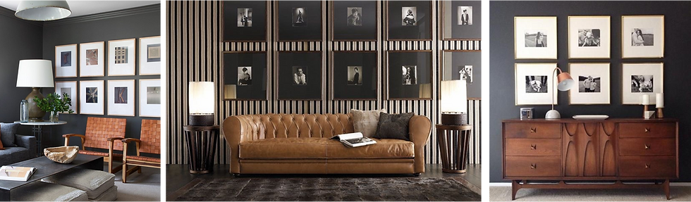
You can create an elegant accent wall by hanging pictures with the same frame in the same size. This way you can create a more organized look. Be sure to measure each frame and then place tape on the wall to dictate where the piece will go. I think this works particularly well if you’re trying to highlight a particular theme or interest.
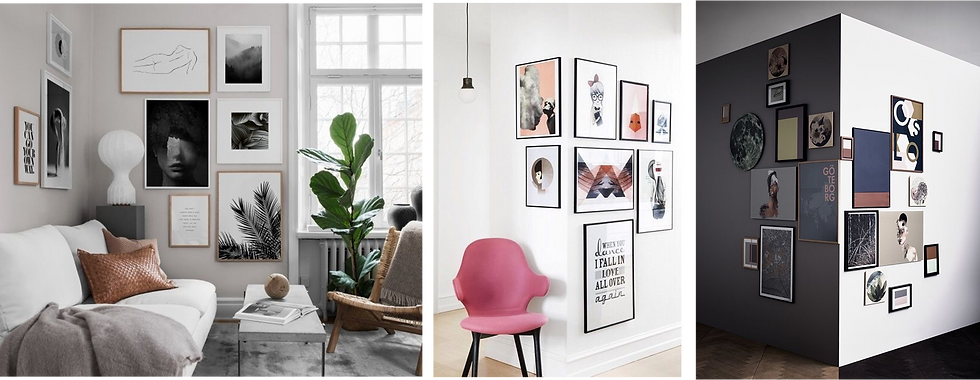
2) Reflection: For those who get headaches from uniformity, you don’t have to worry about arranging by size, colour or with the same frame border. You can create order out of chaos with this arrangement!

This works best especially when working with old photographs or random artworks — the trick is when everything’s matched up and aligned horizontally or vertically at the centre, the outer edges don't have to align, yet the display makes perfect sense.
3) Timelines: I’m not a fan of staircase gallery walls , but for those whoare up for the flight, I’ve found that arranging photographs according to timelines along a staircase can be quite interesting. I love these examples because they have used a slightly different approach.
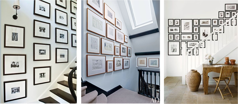
Firstly, I sense a clever linear sequence instead of the regular angular staircase arrangement. Also, the consistent use of the same frame borders, same mount boards, and same visual language e.g. black and white photography means you can’t distinctly pick out old photographs from new ones, plus it makes the gallery wall look a hundred times better, No?
4) Grid: Don’t dismiss the simple grid. It’s a basic arrangement, but it makes a big impact!

What’s better than creating your own life sized 9 square Instagram grid or a rectangular story layout on your wall? Nothing, except the space for it. lol. Also, I don’t know why, but it seems to work best in 3’s and square frames are particularly more striking.
5) Corner: There is definitely an element of surprise with this arrangement, especially when you are trying to break the flatness of a long wall or awkward corner space in a room. Don't use just one wall but go around the corners when it's possible.
This layout works best to draw the eyes closer to the end of a monotonous hallway or corridor without the whole formal hallway gallery feel. Very effective, because you cheer up two walls at once!
6) Ledge : The great thing about picture ledges is that you can easily make changes without making any new holes in the wall.

Whenever you feel like making a little change in the living room, just move things around and use what you already have to create a new look. A simple budget tip you can use for rented apartments.
7) Leaning: This one is very similar to the ledge layout, but it cuts down the use of nails to zero, which is quite a relieve to be honest.

It works best if you are trying to achieve that laid back, effortless look where artworks or picture frames are on the floor or on top of a console leaning casually against the wall. For what it's worth, it is less formal than wall hanging and it saves you the drama of alignment and pluming. For a more laid back look, you can use frameless paintings/prints, canvases or intriguing transparent frames.
8) Vertical: I'm always happy to stumble upon new ways to do things, and the vertical gallery wall layout is no exception.

This is an amazing photo gallery layout for small and narrow spaces and the sheer simplicity blew me away at first sight. Less is truly more.
As you can tell there are endless gallery wall ideas: from random spacing, frame sizes, and alignments, to choosing a theme, creating a mix of paintings, maps or photographs or playing it safe and keeping it simple. Whether you decide to create a large or small gallery wall, no matter which layout you select, it feels good to know that you are creating something special to house that treasured memory for years to come.


Comments